
Lesson 4: The Moving Average Convergence Divergence (MACD) An Introduction
The Moving Average Convergence Divergence (MACD)
Reading Time: 14 Minutes
Developed in 1979 by Gerald Appel, the MACD, or Moving Average Convergence Divergence, has proven a dependable and versatile indicator within the field of technical analysis. Technical analysts employ the MACD across different financial instruments and time periods (timeframes), yet many claim higher timeframes provide more reliable results.
Moving Average Convergence Divergence
At its core, the MACD operates as a trend-following momentum indicator, displaying the convergence and divergence of two moving averages derived from underlying price action. Two exponential moving averages, or EMAs, are calculated by subtracting the two values which leave users with a single dynamic line (MACD line) that oscillates above and below a zero-line. Additional components of the indicator are the signal line and a histogram. Technically, the MACD serves as a lagging indicator as it works with moving averages which are inherently a lagging component. Still, the MACD is also used as a divergence indicator, thus essentially providing a blend of lagging and leading signals.
According to many technical traders, the MACD is efficient and complements most trading strategies, with the ability to analyse different asset classes such as foreign exchange (Forex), individual shares, equity indices, commodities, and cryptocurrencies.
MACD Indicator Calculation
The formula to calculate the MACD is straightforward:
• MACD Line:
The MACD line is an important component and is formed by subtracting the 26-Day EMA from the 12-Day EMA. To be clear, if working with timeframes lower than the daily chart, the MACD line is formed through the chart’s time period. As an example, trading on the H1 timeframe calculates the MACD line as follows: 26-hour EMA - 12-hour EMA.
• Signal Line:
Once the MACD line is computed, the signal line can be determined. This is found by calculating a 9-day EMA of the MACD Line and is presented as an additional moving average alongside the MACD line.
• MACD Histogram:
Designed by Thomas Aspray in 1986, the final component in the indicator is the MACD histogram, computed by subtracting the MACD line and the signal line values which display vertical bars (histogram) that oscillate around a zero-line. What this offers market participants is a measure (or spread) between the MACD line and signal line.
MACD Interpretation
The MACD allows for a number of strategies, including crossover signals—think basic trend-following crossover strategies—and divergence signals.
MACD Zero-Line Crossover:
A zero-line crossover involves the MACD line crossing beyond the zero-line. Depending on the timeframe and underlying trend strength, the MACD can remain above/below its zero-line for prolonged periods.
When the MACD value merges with the zero-line, the EMAs that form the MACD line are equal; they have converged. A MACD value running from negative to positive informs users that the 12-day EMA is above the 26-day EMA. Conversely, shifting beneath the zero-line demonstrates that the 12-day EMA is below the 26-day EMA.
Positive MACD values north of the zero-line increase as the 12-day EMA diverges further from the 26-day EMA, meaning momentum is to the upside. Negative MACD values, nonetheless, increase as the 12-day EMA diverges further below the 26-day EMA south of the zero-line, expressing that the market’s downside momentum is increasing.
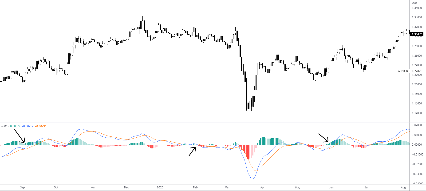
Figure 1.1 illustrates three bullish and bearish zero-line crossovers, which are employed to aid trend-following systems.
MACD Signal Line Crossover:
Similar to the stochastic oscillator, a common MACD strategy embraces bullish and bearish signal line crossovers. Functioning as a moving average of the MACD line, the signal line tracks (lags) MACD movement.
A bullish crossover occurs when the MACD line makes its way above its signal line. A bearish crossover, on the other hand, takes shape once the MACD line moves below its signal line. Subject to the timeframe selected and the strength behind the move, crossovers can range anywhere from minutes to months.
Nonetheless, it must be noted that—similar to other crossover methodologies—bullish and bearish signal line crossovers can yield false signals and are inherently lagging. This means a crossover signal transpires after an up or down move materialises.
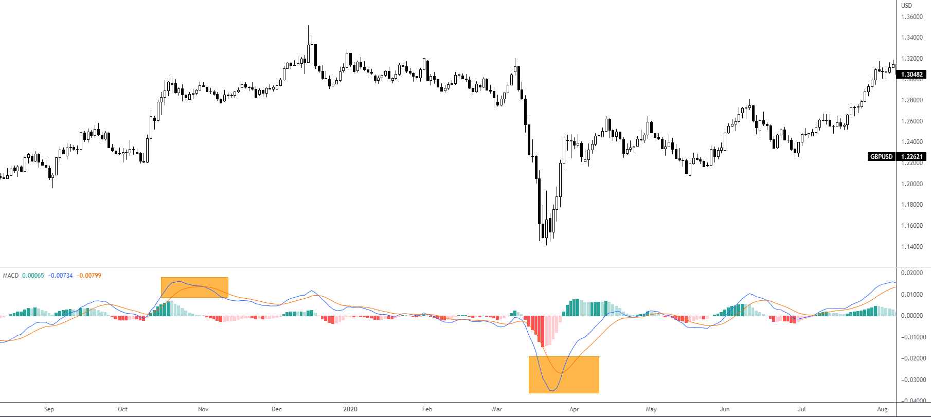
Figure 1.2 demonstrates a bullish and bearish signal line crossover.
Overbought and Oversold:
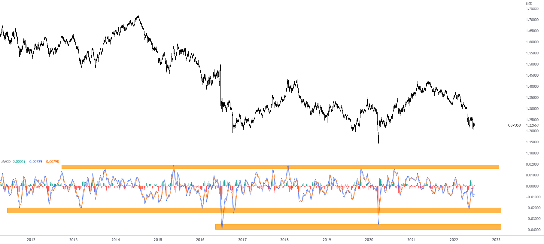
As an unbounded indicator, determining overbought and oversold conditions is problematic. Chartists attempt to combat this by estimating historical extremes through a simple visual assessment, similar to how technicians apply traditional support and resistance areas on a price chart.
Figure 1.3 shows an upper boundary of resistance applied to the indicator that performs as an overbought indication. Identifying the lower boundary is more complicated on the selected chart, due to data outliers in July 2016 and at the height of the COVID pandemic in March 2020. In this case, numerous oversold regions can be used to include all scenarios.
Divergences:
Divergence is a popular leading measure in the MACD, representing a discrepancy between price movement and the MACD line. At its simplest, traders look for regular bullish and bearish divergences to identify a potentially weakening market. Note that closing prices are used in the calculation and, therefore, closing prices should be used to mark price divergences (not upper and lower shadows).
Regular Bullish Divergence:
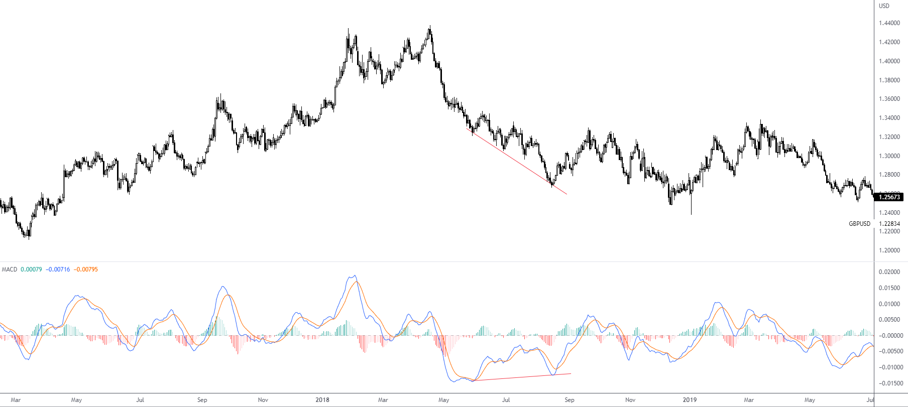
Price action forms lower lows (and lower highs) and confirms the downtrend while the MACD line shows an advance (higher lows/highs); this is referred to as regular bullish divergence. This informs the user that sellers could be running out of steam (momentum to the downside is slowing) and a reversal may unfold.
Regular Bearish Divergence:
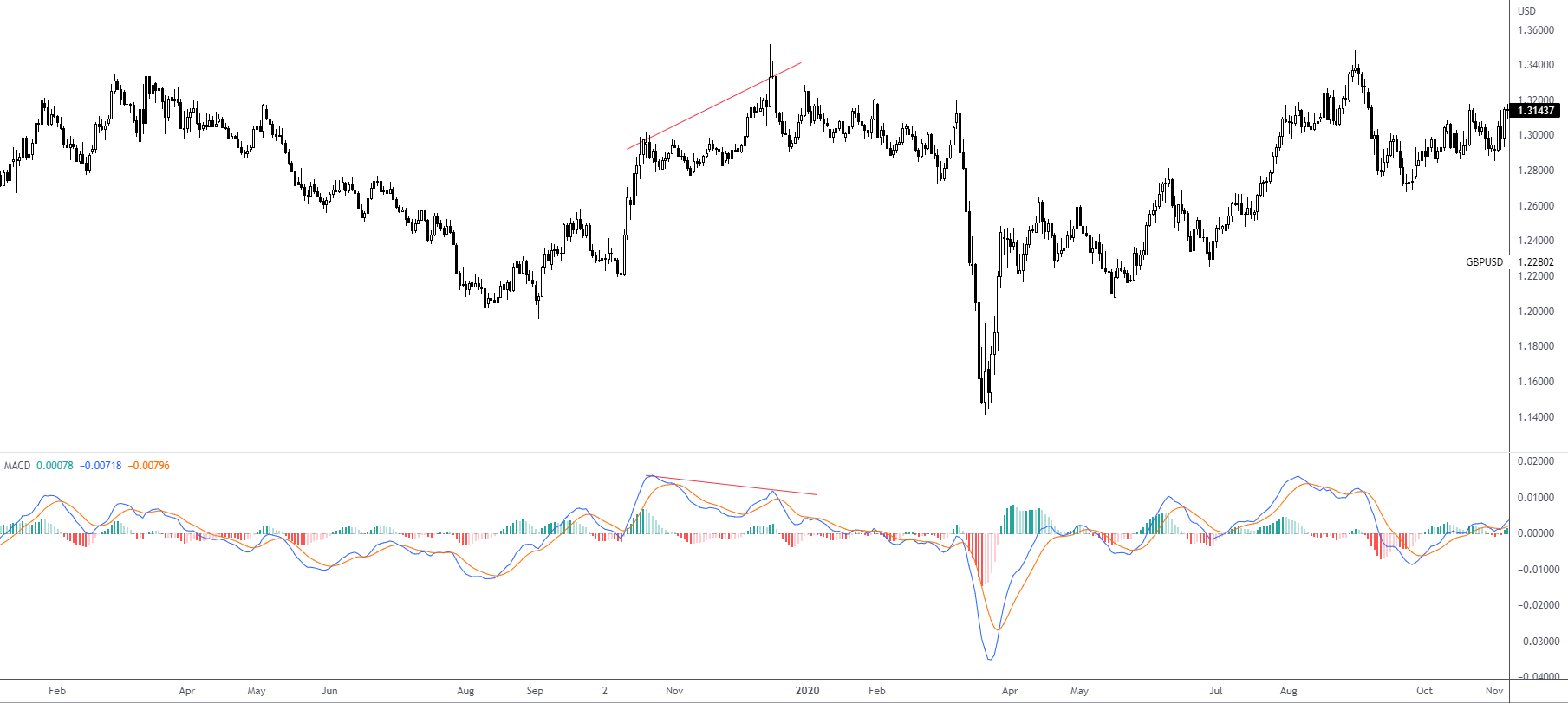
If the price forms higher highs/lows and the MACD line declines to form lower lows/highs, the indicator is displaying bearish divergence. The price high confirms the current uptrend, but the lower high on the MACD indicates less upside momentum. And slowing upside momentum can sometimes foreshadow a trend reversal or a sizable move to the downside.
Hidden Divergence:
More advanced traders occasionally adopt hidden divergence. Hidden divergence is referred to as hidden because it’s not always obvious. This tends to occur within an existing trend and can specify strength, informing traders that the trend may resume. Hidden divergence is similar to regular divergence—where the price and MACD line move oppositely, though price takes more of a leading role in this case.
Hidden bullish divergence consists of a higher low in price and a lower low on the MACD line. Hidden bearish divergence is the reverse; price establishes a lower high and the MACD line takes on a higher high.
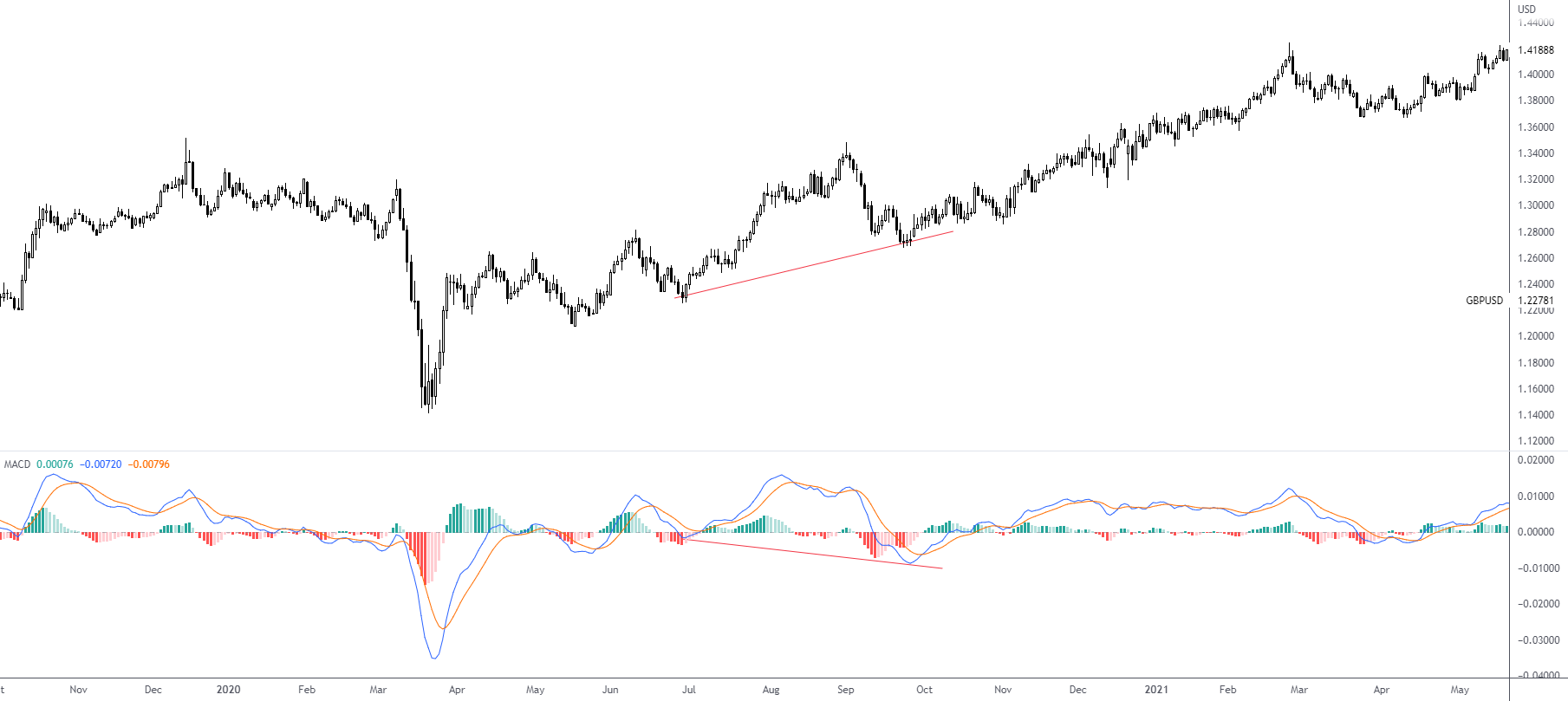
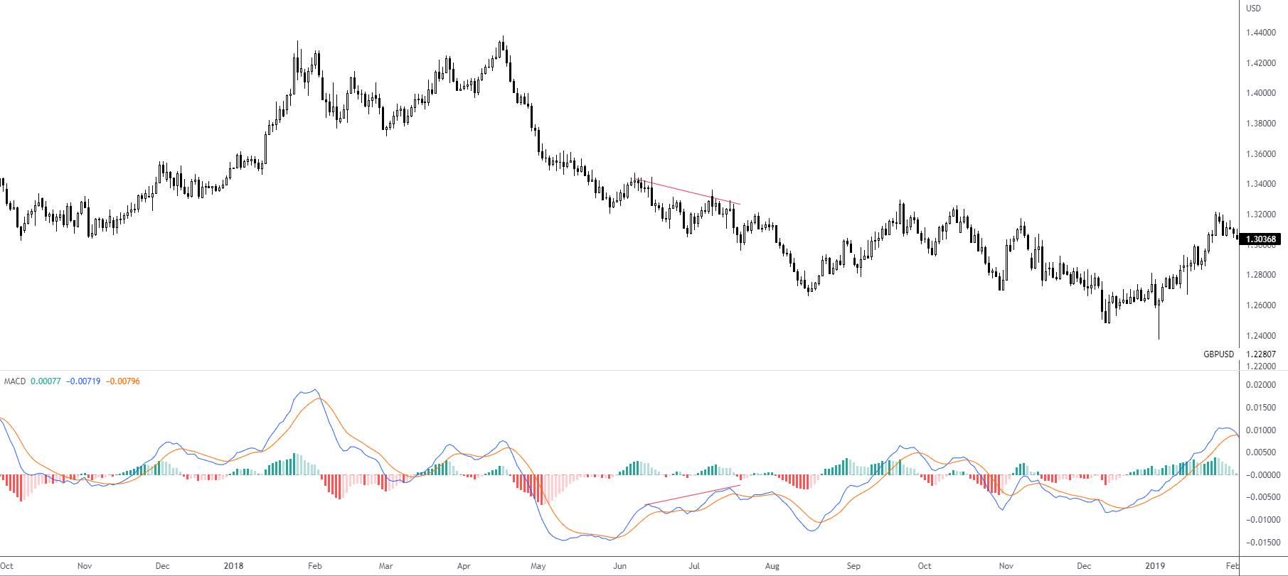
It’s important to understand that regular and hidden divergence are not in place to deliver clear entry signals; they’re designed to indicate weakness (or strength) of the underlying trend.
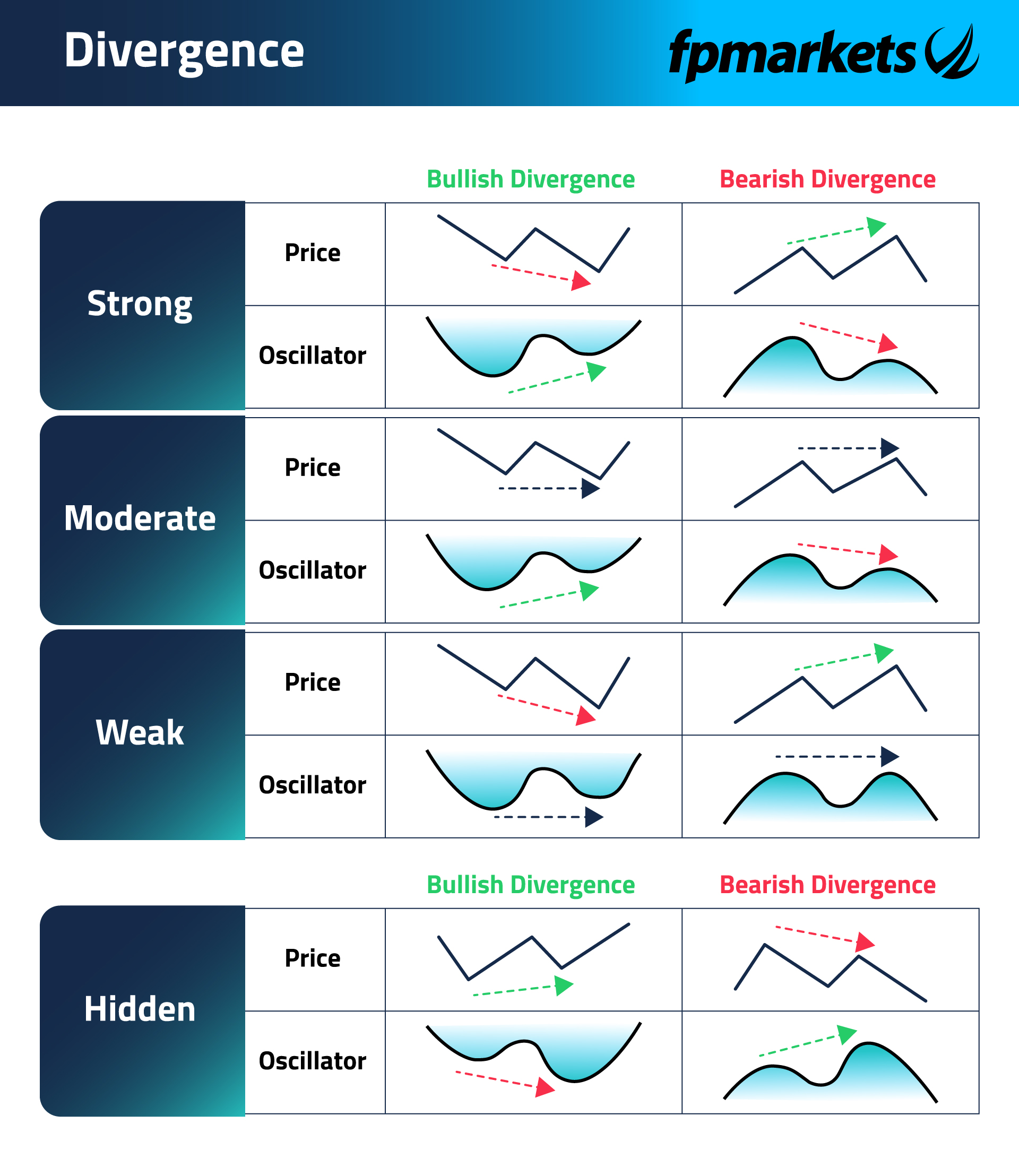
For those who prefer a drawn diagram regarding divergences, figure 3.2 provides an in-depth illustration.
MACD Histogram Divergence:
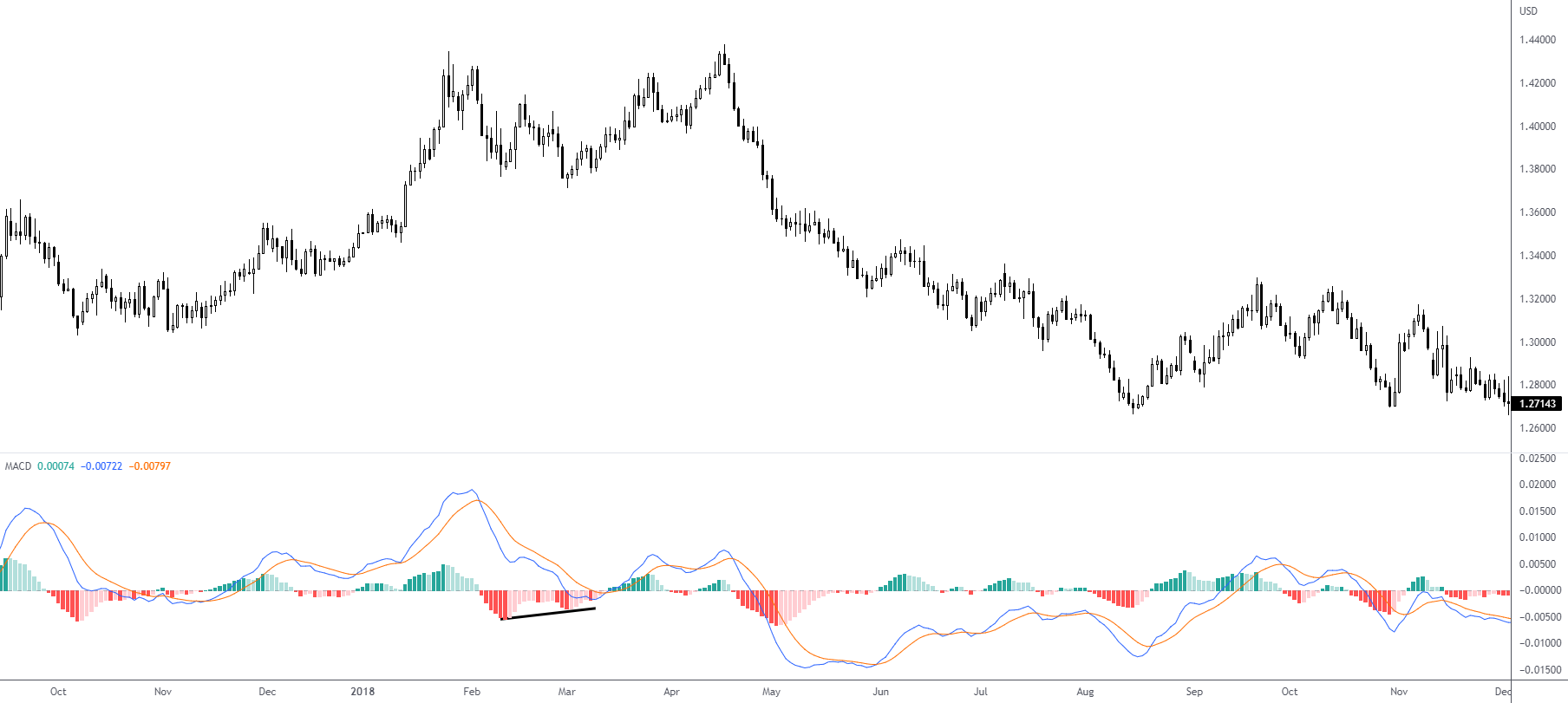
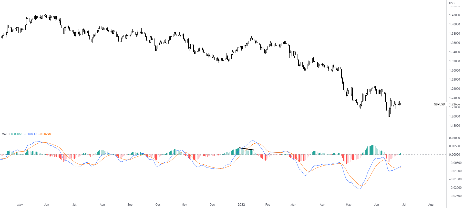
The MACD histogram is used to help forecast—through divergences—bullish and bearish signal line crossovers. Think of this as a leading indicator of a crossover.
Figure 3.3 shows a bullish histogram divergence; the MACD line forms a lower low and the MACD histogram diverges and creates a higher low between two troughs. This signals that a bullish signal line crossover is likely to occur (which it did).
Conclusion
While additional MACD strategies are available, the article has highlighted the basics to get you started. Ultimately, though, how traders choose to use the MACD is down to their individual trading style. The majority of technical analysts use the indicator to confirm. This could mean confirming additional technical indicators or even price levels, such as support and resistance.
A final (yet crucial) point is that most traders tend to seek bullish and bearish signal line crossovers and divergences within pre-determined oversold and overbought areas. However, hidden divergences tend to be absent of oversold and overbought areas.
 Access 10,000+ financial instruments
 Auto open & close positions
 News & economic calendar
 Technical indicators & charts
 Many more tools included
By supplying your email you agree to FP Markets privacy policy and receive future marketing materials from FP Markets. You can unsubscribe at any time.
Source - cache | Page ID - 4741